UX Design
SaaS Task Flow Redesign with 25% Task Reduction
#In-house Project
Completed
This project focused on transforming raw and complex datasets into clear, actionable insights through modular dashboard design. By establishing a scalable widget system, information hierarchy, and data visualization principles, the dashboard enabled users to quickly monitor performance, identify issues, and make informed decisions with minimal cognitive effort.
As a UX Designer at Wistron ITS (WITS), I led the dashboard design process from requirement clarification to interface delivery. I restructured existing widgets, and defined reusable modules to support scalability across multiple use cases. Working closely with developers, I balanced technical constraints with business goals to deliver a consistent and flexible dashboard experience.
Period
5 Months | 2 Design Phases.
The screens shown in this portfolio are for illustrative purposes only and do not represent the actual project interface. All rights belong to the original owner.
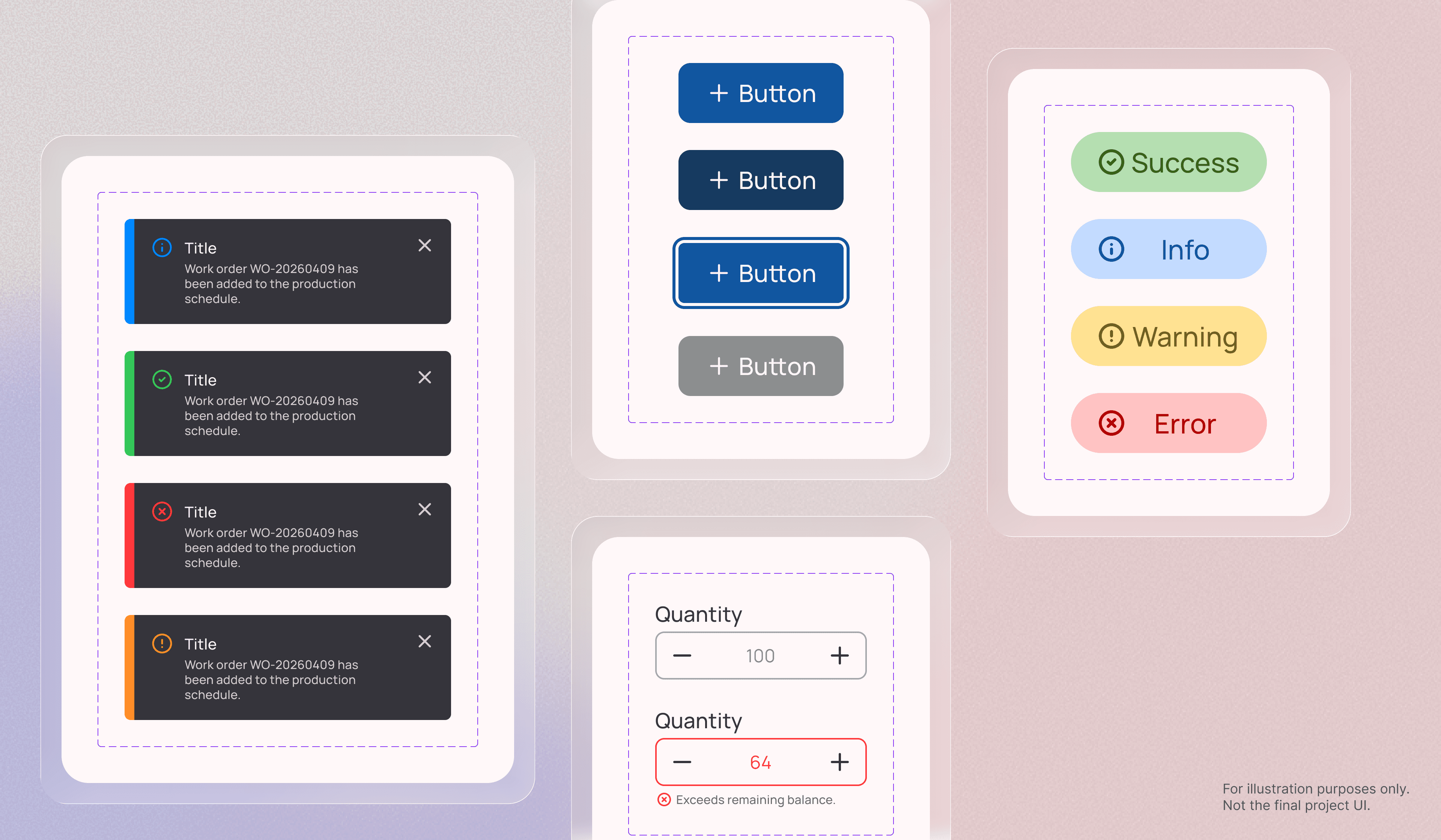
Established a modular dashboard system to ensure consistency across interfaces, regardless of the designer involved, while reducing learning costs for users navigating different dashboards.
Clarified dashboard requirements and organized reusable widgets based on content structure and usage scenarios. Starting from foundational components, I built scalable modules that could adapt across multiple dashboard layouts. Variables and interaction states were systematically defined across style, type, and status to maintain consistency and support future scalability.
By balancing readability with information density, the dashboard enabled users to efficiently scan, compare, and monitor data without overwhelming the experience.
Utilized typography, color, shape, and spacing to establish a clear information hierarchy across data-heavy interfaces. Edge cases for both minimum and maximum data states were also considered to maintain layout consistency and visual balance.
For example, bar chart configurations could range from one to multiple data points, so I defined responsive bar widths and alignment behaviors for low-data scenarios to preserve readability and visual stability.
Supported faster decision-making by transforming complex datasets into clear and actionable visual insights.
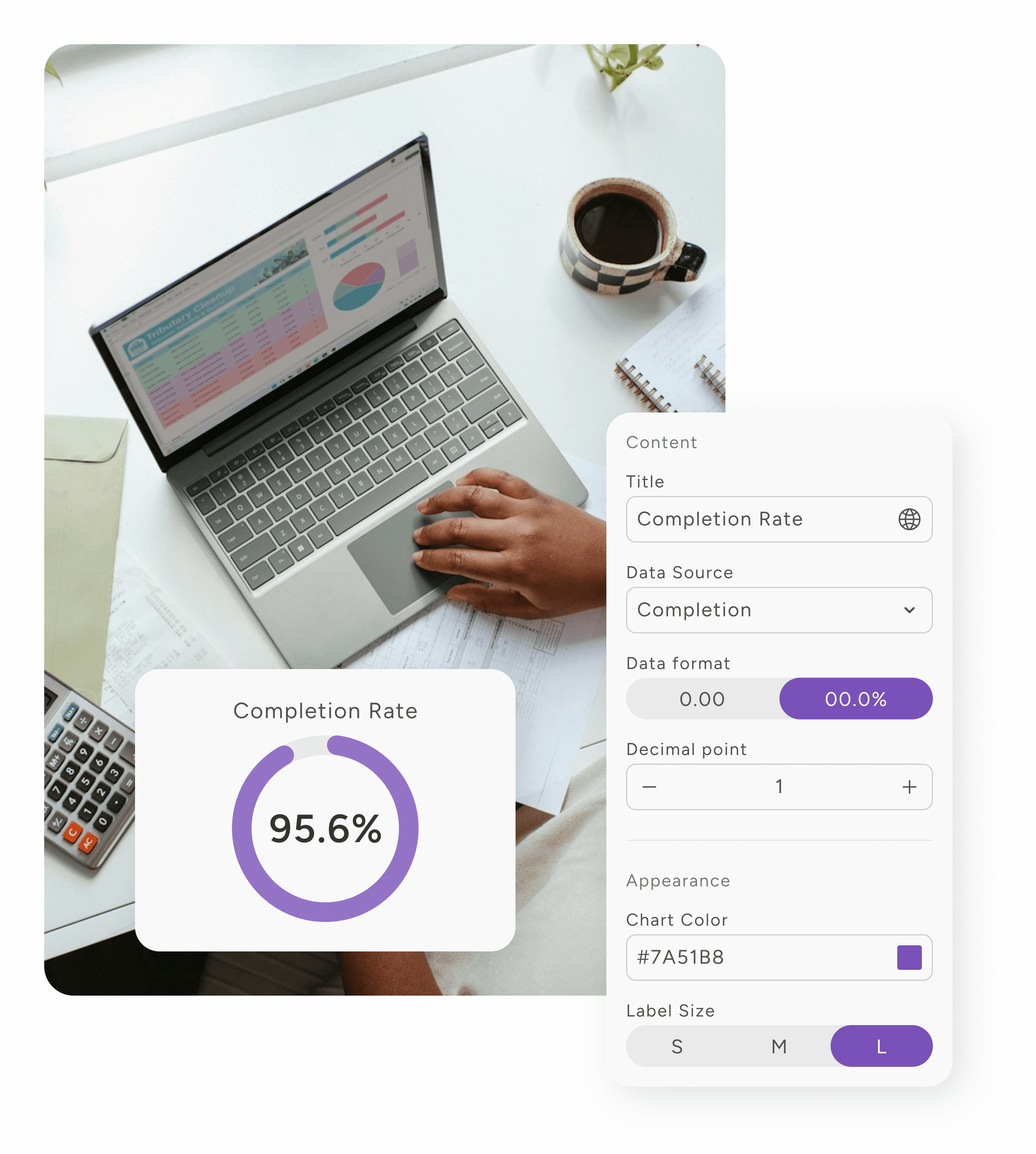
Evaluated the intent behind each dataset and selected the most appropriate visualization method for the task. Line charts were used to reveal trends and performance changes over time, while visual cues such as color and emphasis highlighted key metrics. This approach helped users compare multiple stations efficiently and identify issues without manually interpreting large volumes of tabular data.
Enabled users to customize dashboards based on their needs while maintaining a consistent and predictable experience across the platform.
Analyzed overlapping configuration scenarios and grouped settings into clear categories, including data source and type, content, and appearance. To balance flexibility with consistency, customization options were intentionally constrained to meaningful choices, such as predefined widget sizes (S, M and L), helping users configure dashboards efficiently without introducing unnecessary complexity.