

Design System
Building Accessible and Scalable Design System
#Client Project
Completed
This project focuses on identifying user pain points, clarifying task requirements, and simplifying the existing task flow. Through Task Flow Analysis, quantifying the number of steps, decisions, and UI transitions required to complete a task.
As the UX designer at Wistron ITS (WITS), I owned the redesign of SaaS task flow based on client needs, uncovering friction points, refining task structures, and delivering a more intuitive, efficient, and scalable experience.
2 weeks
The screens shown in this portfolio are for illustrative purposes only and do not represent the actual project interface. All rights belong to the original owner.
0 %
0 %
Reduce task flow
0
0
Screen made
0 %
0 %
Development- success
0 weeks
0 weeks
Period
"I wasn't sure what the next step was."
"I couldn't tell where the newly added data went."
"I had to scroll up and down repeatedly to verify the information."
The action sequence was unclear, causing users to hesitate or repeat steps.
Table structure was confusing that data from different methods appeared in mismatched locations, making it difficult to verify results.
Excessive up-and-down scrolling disrupted user focus and task continuity.
Mapped and reorganized the existing task flow, then redesigned it to be more efficient and intuitive for users.
Select one main flow to use as an example.
Primary actions were placed alongside each section to guide users through the process, while a unified table served as the single destination for all newly added data. This made the task flow easier to understand and reduced uncertainty throughout the task.

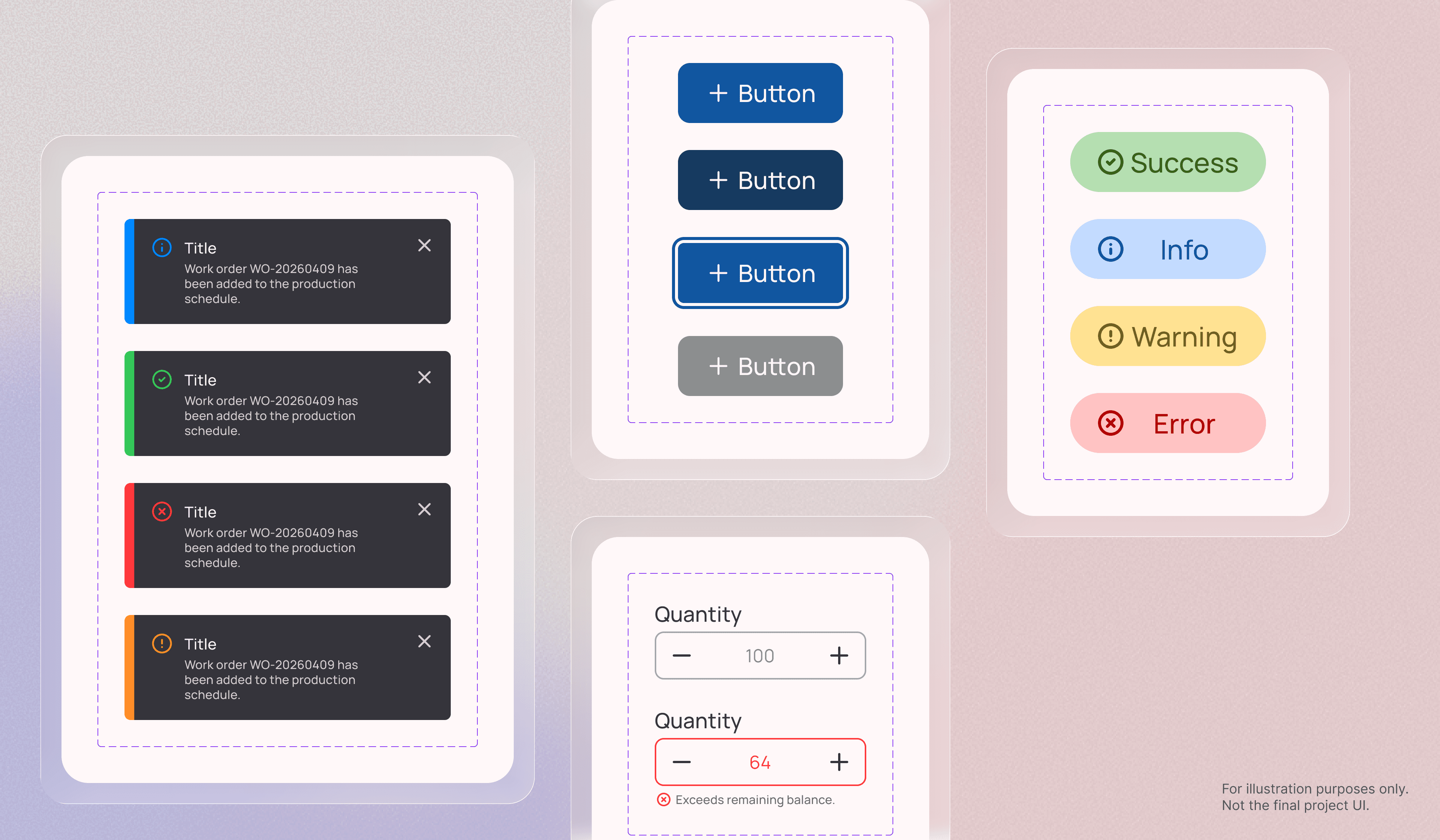
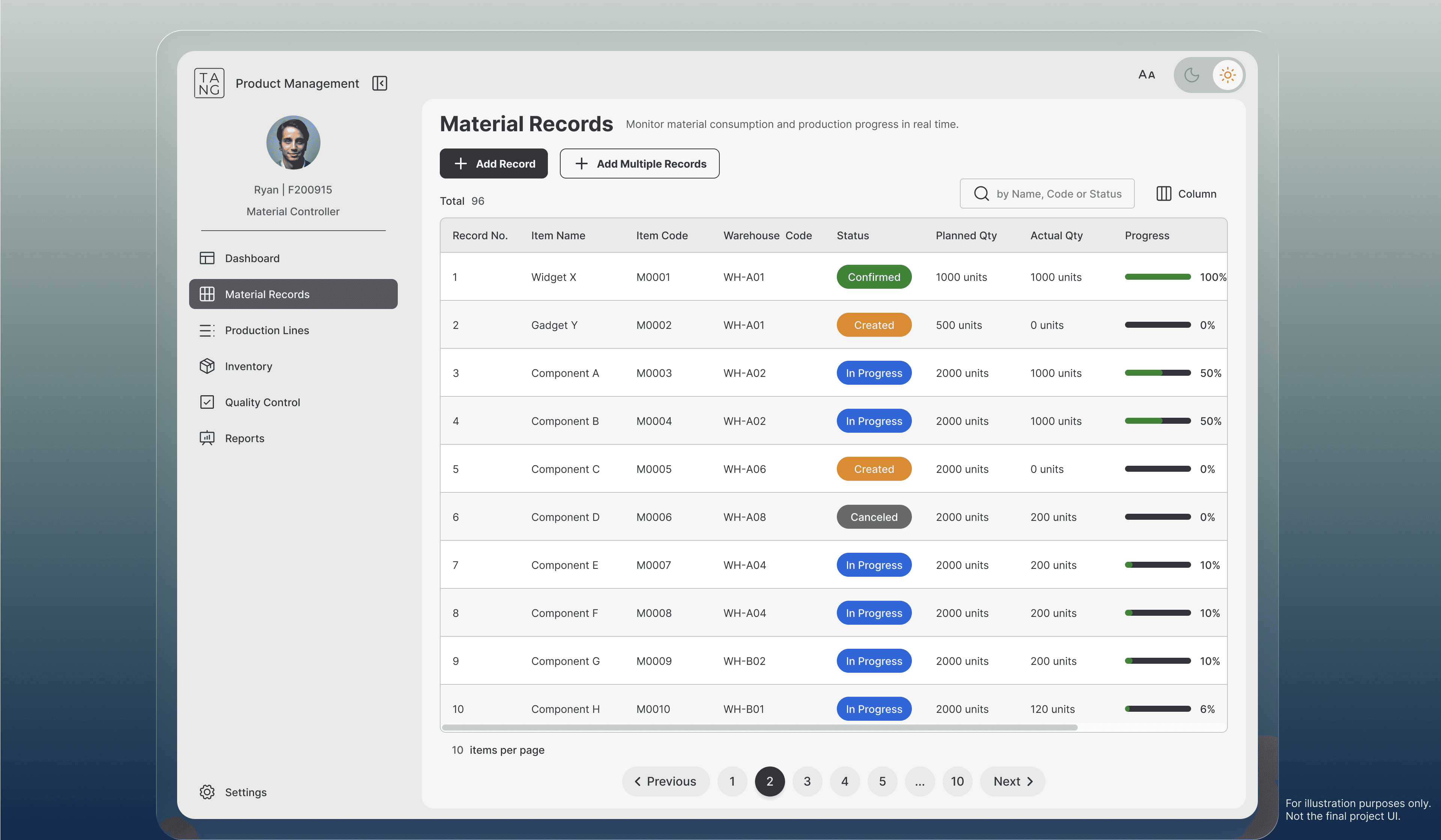
This screen is for demonstration purposes only and was generated using Stitch AI.
Utilized a dialog to replace repetitive scrolling and reduce unnecessary interaction effort.

This screen is for demonstration purposes only and was generated using Stitch AI.
I applied a structured task-analysis method (source attached) to compare the original flow with the enhanced flow. By assigning a weighted score to each action based on its level of complexity, I was able to quantify overall effort across both journeys.
Scoring method:
Scroll = 1 point
Click = 3 points
Type = 5 points
Key outcomes: 25% reduction in interaction cost, scroll actions eliminated, and clicks reduced by 23%.
I redesigned the original task flow and reduced overall complexity by 25%. By mapping the existing journey and identifying pain points, I removed unnecessary actions and created a smoother, more intuitive flow. I also clarified the purpose of the data table to improve hierarchy and reduce confusion.
Throughout the process, task flow analysis helped validate the improvements and confirmed the positive impact of the redesigned flow. In the future, usability testing would provide deeper insight into user behavior and emotional response. This project reinforced how intentional task flow design can meaningfully elevate the user experience.


