
UX Design
SaaS Task Flow Redesign with 25% Task Reduction
#In-house Project
Completed
This project focused on refining an existing design system to improve consistency, accessibility, and scalability. By reviewing real usage scenarios and identifying gaps in components, interaction patterns, and accessibility standards, the system was optimized to better support designers and developers while delivering a more inclusive product experience.
As a UX Designer at Wistron ITS (WITS), I owned the creation and ongoing maintenance of the design system based on client needs. I refined design principles and usage scenarios to deliver a more accessible and scalable experience.
The screens shown in this portfolio are for illustrative purposes only and do not represent the actual project interface. All rights belong to the original owner.
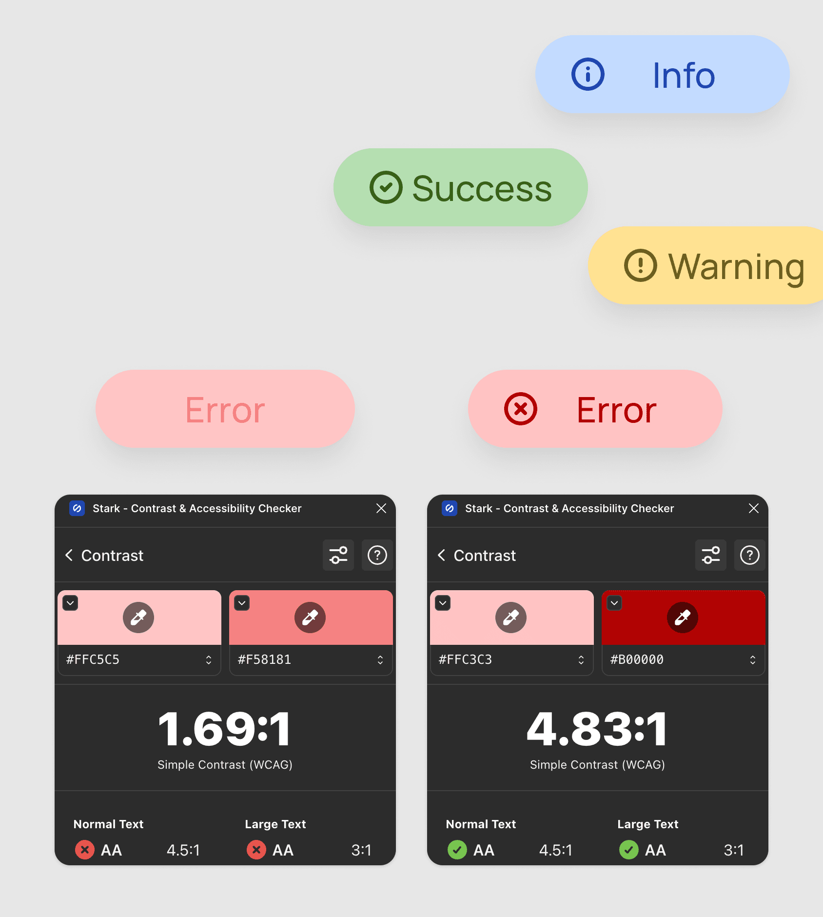
Enhanced readability and visual comfort by refining color contrast across core components.
Identified insufficient contrast in key UI elements that impacted readability. Through a color system audit and WCAG AA validation using the Stark plugin, I refined 21 chip color variants while preserving brand consistency, resulting in improved visual hierarchy and accessibility.
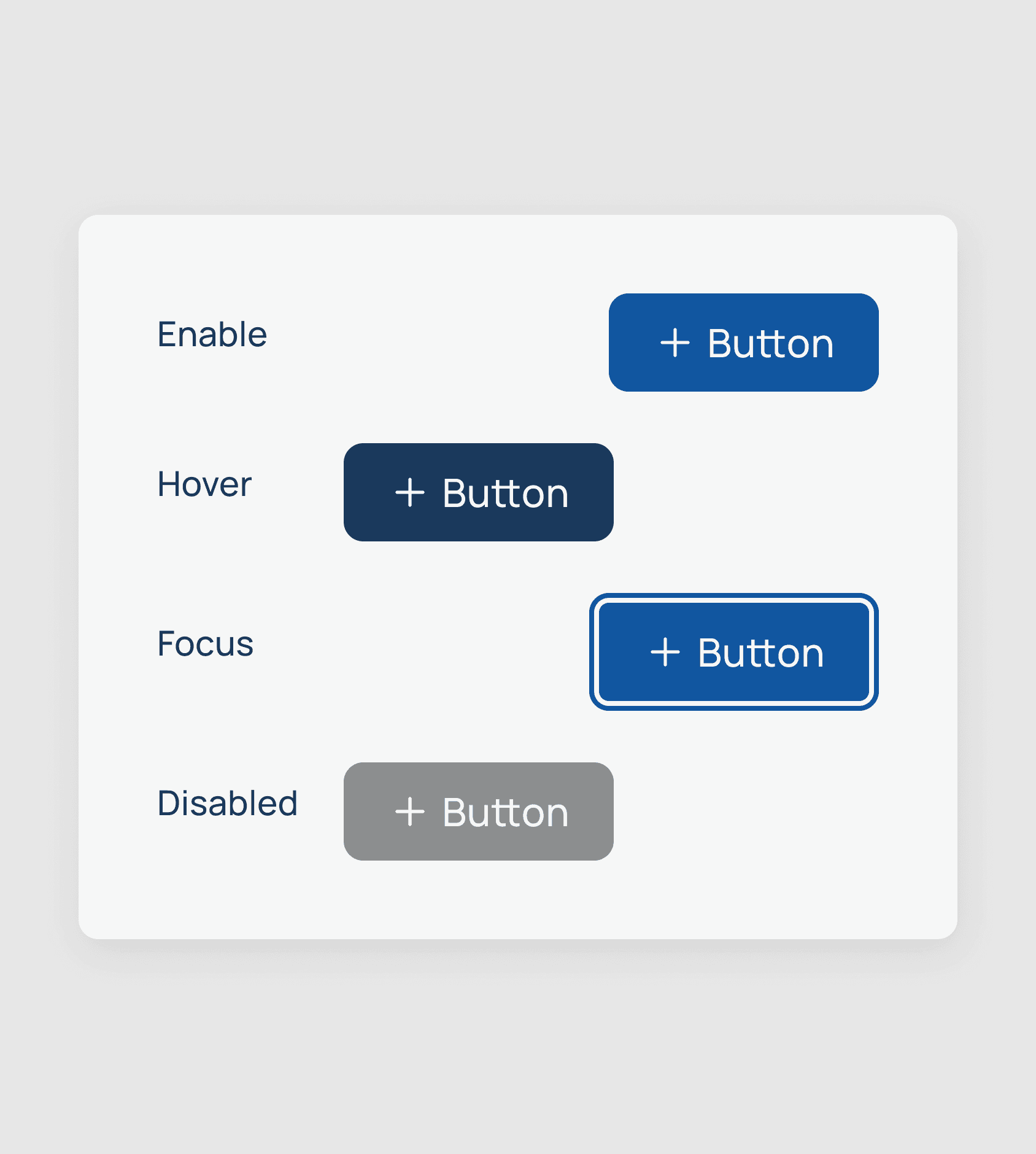
Improved interaction feedback and keyboard accessibility through clearer focus states.
Reviewed existing focus behaviors to better support keyboard navigation and interaction clarity. By refining focus styles across components, users can more easily understand their current state and available actions, improving overall usability.
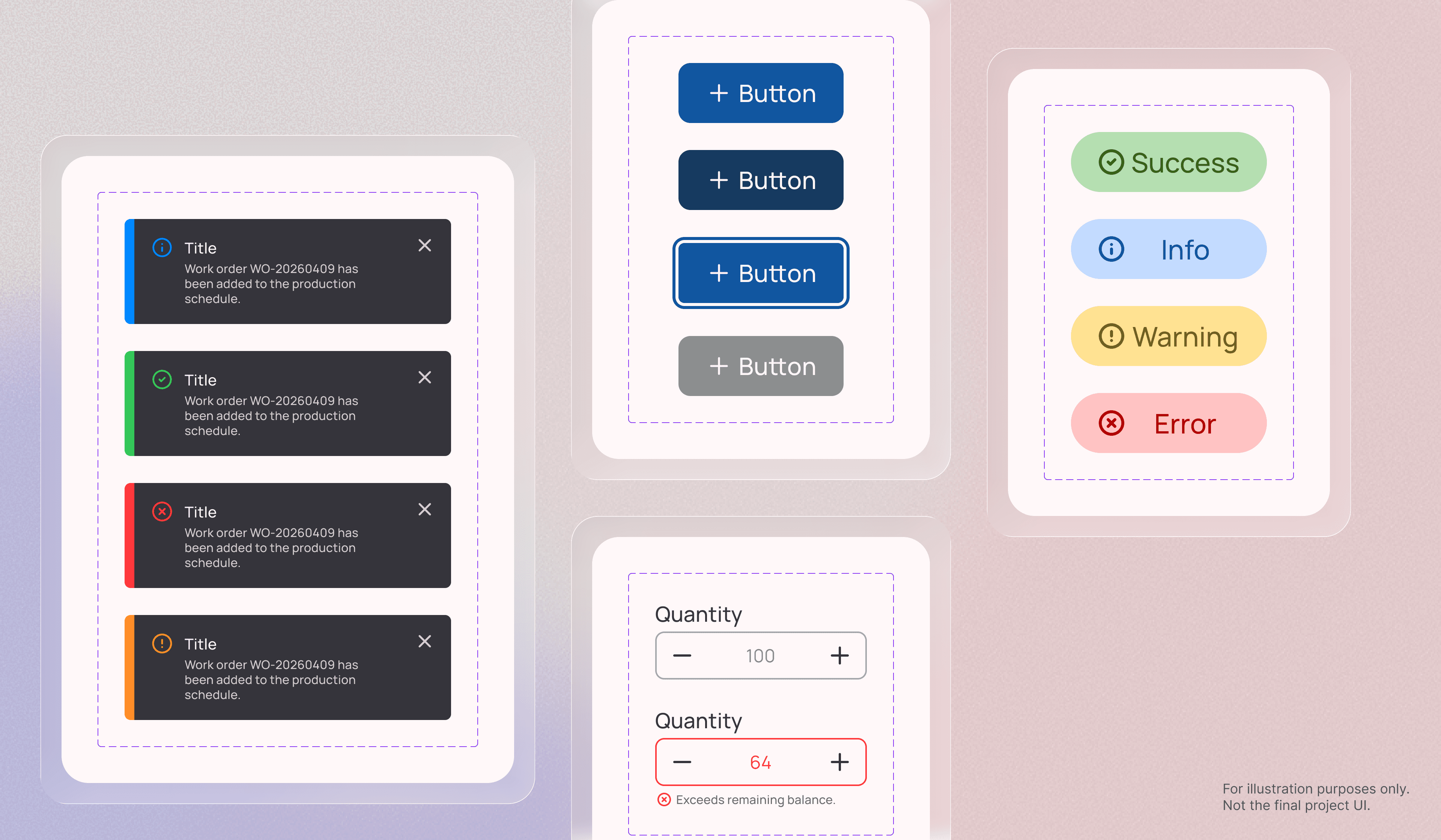
Increased consistency and cross-team alignment in notification usage.
Identified unclear usage of inline messages within the notification center. After defining distinct scenarios and introducing a standardized toast pattern,I documented clear guidelines covering appearance and disappearance timing, style, and maximum number of toasts to ensure consistent implementation across teams..
Demo video generated by Claude Design.

Reduced cognitive load and improved usability during numerical input.
Found the original number stepper conflicted with common design conventions. After researching standard patterns and aligning with the team, I proposed a revised interaction that feels more intuitive and easier to use.
Through building and maintaining the design system, I realized that designing a single component is fundamentally different from creating components that scale across multiple product lines. This experience strengthened my ability to think systemically by considering the broader architecture early and anticipating how components behave across various scenarios.
Beyond ensuring visual consistency, I learned the importance of balancing the needs of designers and developers. Accessibility considerations, including color contrast, touch target size, and focus visibility were integrated at the foundational level instead of being treated as enhancements.
Another key learning was the impact of structured design tokens and semantic naming. By adopting a hierarchical token structure such as color.background.chip.primary.info. By systematically structuring component variables across visual, behavioral, and structural dimensions, the system improved maintainability and scalability. This structured approach reduced cognitive load for designers and improved implementation clarity for developers.
This project reshaped how I approach design decisions by prioritizing scalability, accessibility, and long-term system sustainability from the outset.


